UX Snippets: Avoid mismatching instructions and actions
Money Dashboard is an excellent app. Apart from when it’s telling me that I’ve gone over my monthly coffee budget.
Or when it gives instructions that don’t match what you see on screen.
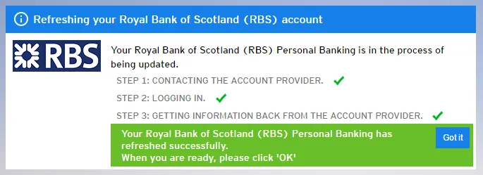
It’s not a huge deal since it’s pretty obvious what the intention is, but it’s just one more little mental leap that the user has to make to do something.
And we know that we shouldn’t force users to think.