The horrible UX of the National Lottery website messaging system
Yes, I’m one of those fools that plays the lottery. Seeing as there’s no way I’m going to queue at the supermarket to get a paper version of my could-be-worth-millions lottery ticket, that means I have to suffer the official website if I want to play.
There are a fair few issues with it but I’m going to be concentrating on the messages system because it’s been driving me mad today.
1. I don’t need messages on the site
Before we even get to the website, any messages are already emailed to me so 99% of the time (actually probably 100%) I’ve already read them by the time I get to the site so I’ve got no inclination to click through and read them again.
2. The message notifications get in the way
When I visit the site, I’m usually trying to accomplish something (like, y’know, buy a ticket). This isn’t useful:
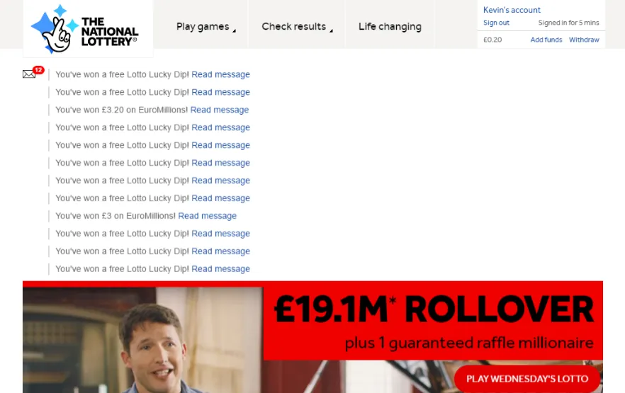
Even more galling is that not one of those messages has any more useful information in the body of the message than they have in the title.
3. The message notifications break scrolling
Okay, so the notifications take up at least 50% of the visible screen – I can still scroll past them, right?
Not really.
The 89 requests and 1.2Mb of content take about 4 seconds to load on my machine (and a couple of click trackers never load – thanks, AdBlock!). The main JS file (min.main-[someguid].js) is the last to load. When it does, the site jumps back to scroll position 0.
So, if you start scrolling down to the action buttons when the page loads, you get about 4s until you’re thrown back up to the top.
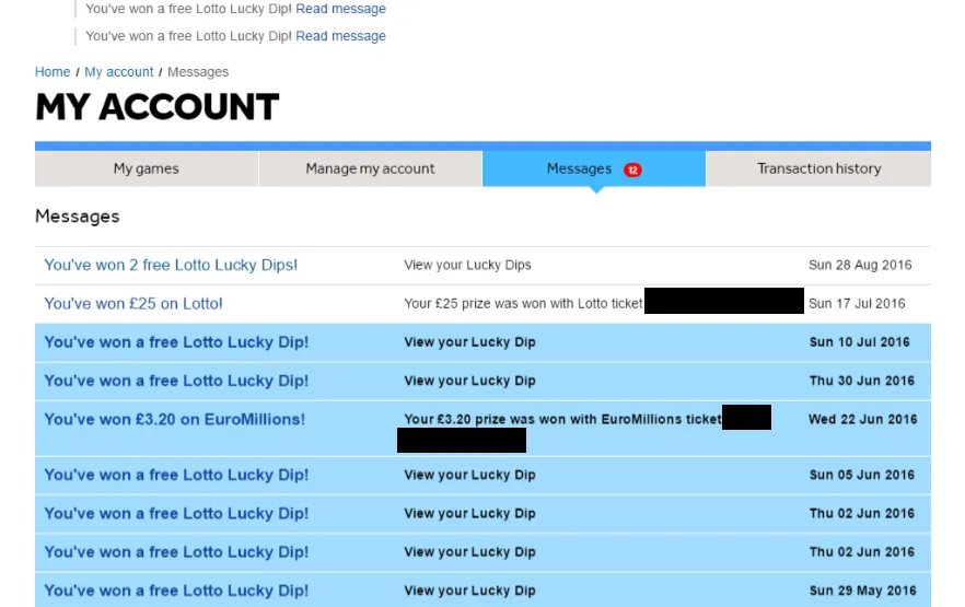
4. There’s no option to mark all as read/delete all messages
Messages are so important that, when you go to the messages page (My Account > Messages [no direct link from home]) then there’s no way to click something to mark them all as read.
Also note that it is possible to win sometimes.
5. Links a click-jacked so you can’t just bulk-open them all as read
By the time I got to this stage, I thought “Right, I’ll just open all the messages in new tabs and that’ll mark them as read“. Typical foolish optimism of a lottery player.
My plan was to middle-click (non-context click) each of the message links so that it would look as if I’d read them. But, alas, it seems that there’s a (poorly coded) click listener on the message links so using the middle-click opens a new tab with the message and also opens it in the current tab. Awesome.
Defeat
So here I sit – defeated and broken, clicking on each message in turn so that I can clear the notifications.
It almost makes it not worth winning anything…